
B&M Florist
A full e‑commerce website, desktop and mobile, for a Sydney florist established in 1987, from home page to checkout.
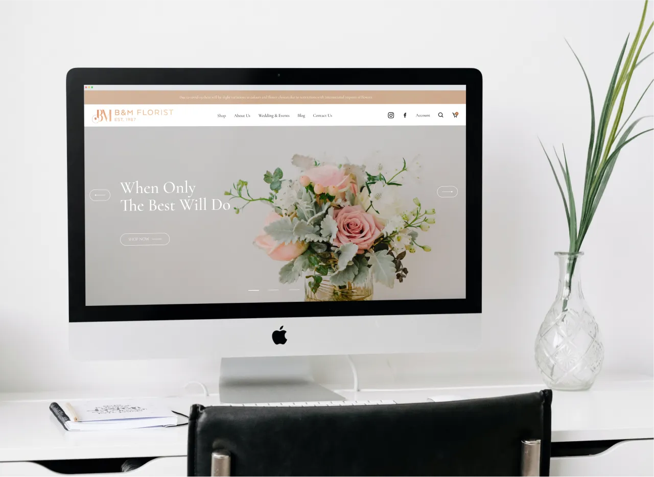
Context
B&M Florist is a family florist in Sydney’s south, trading since 1987, with a shop, a weddings and events side and a run of media appearances and industry awards. They needed a website that sold flowers online as well as it told that story, and that worked as well on a phone as on a desk.
My role
I designed the whole site, freelance through SlickWeb: every page at desktop and mobile widths, the shop from collection to product to checkout, and the components they share.
The work
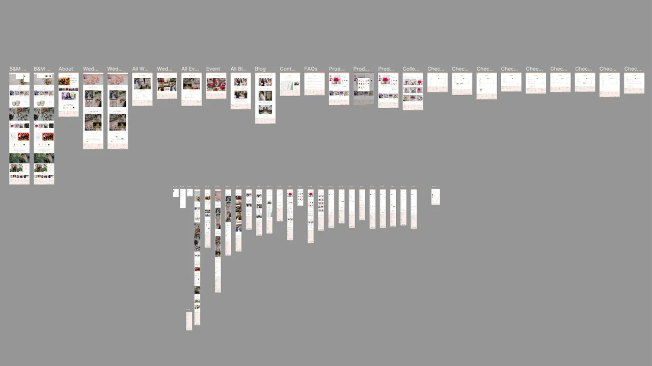
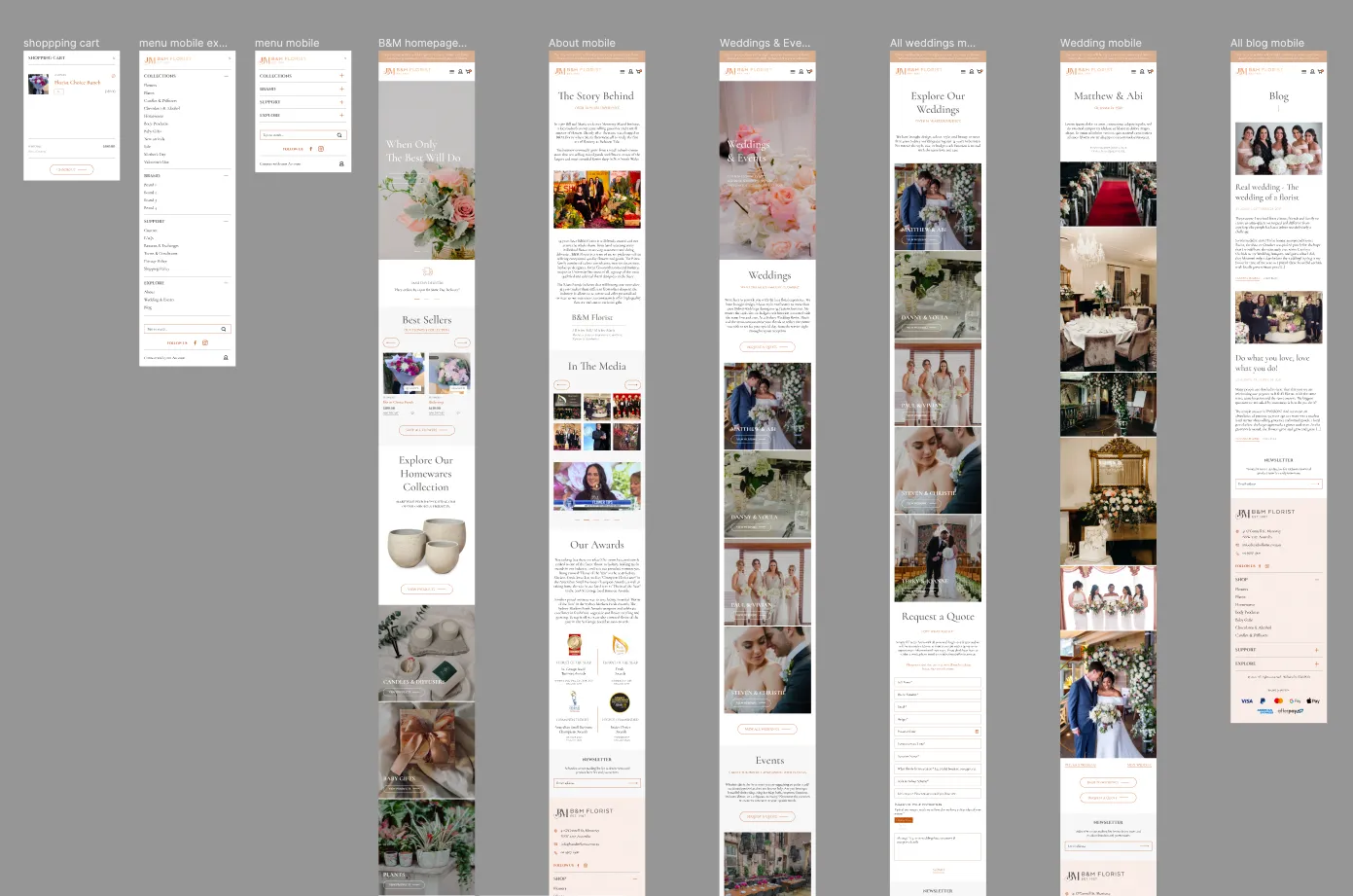
One system, thirty‑odd pages. I started with the site map in Figma so the shop, the editorial pages and the weddings side could share a header, a footer, a product card and a set of section patterns rather than each being its own design.
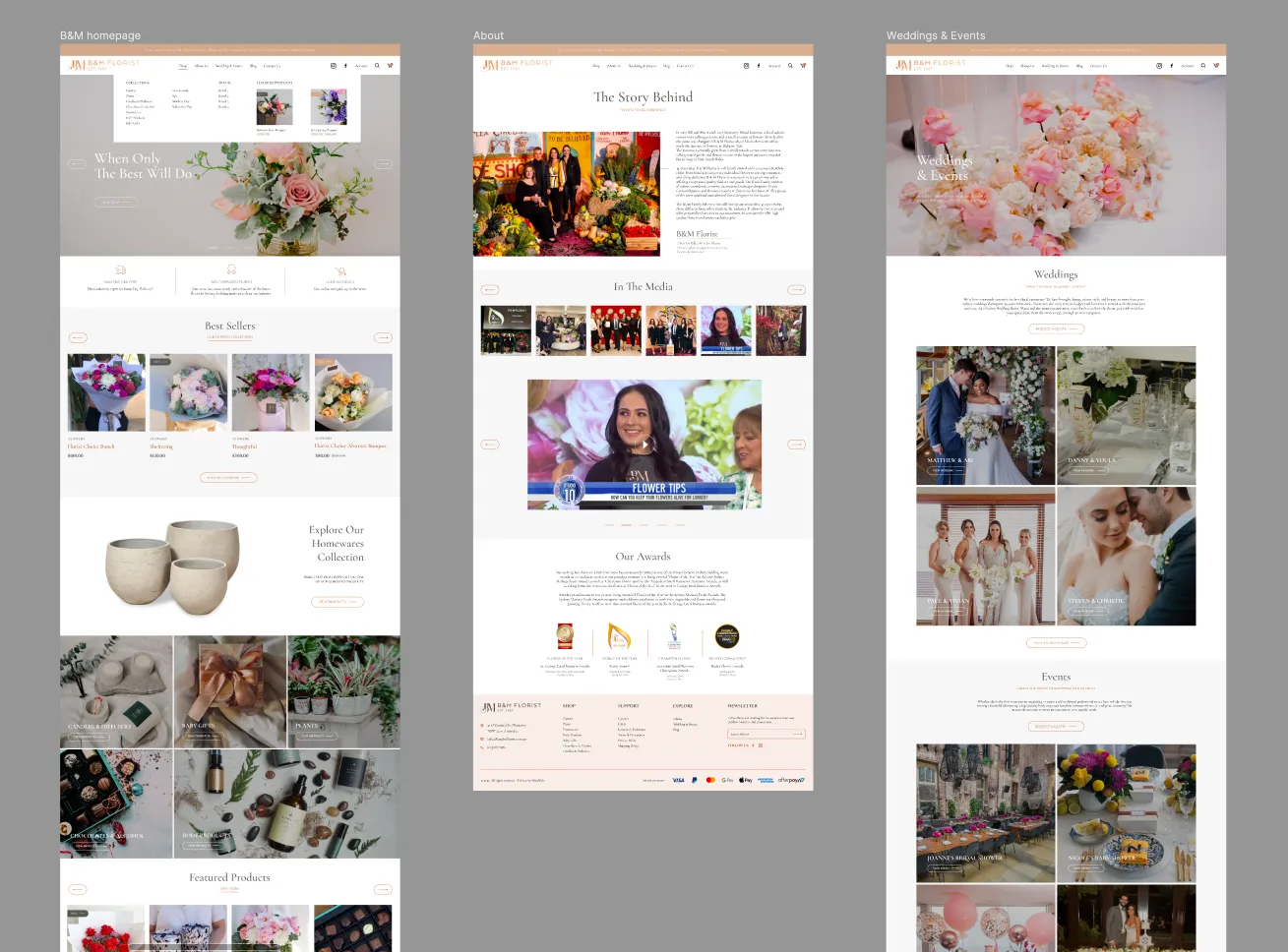
Editorial where it earns it, shop where it sells. The home page opens on photography and a slow, serif headline, then moves into best sellers, the homewares collection and featured products. The about page tells the family’s story with press and awards; weddings and events get a gallery‑led page with a quote request built in.
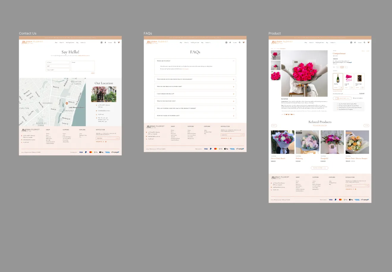
Mobile first in practice, not just in name. Every page has a mobile version designed alongside it, including the menu, the cart and the checkout, so nothing was left for a theme to improvise.
Outcome
A complete, consistent e‑commerce design for desktop and mobile, page by page: home, shop, product, collection, checkout, about, weddings and events, blog, contact and FAQs. SlickWeb built it, and the site is live at bandmflorist.com.au.